
Summary: Microsoft's new Windows 8 interface, formerly known as Metro, is a clear break from the ageing desktop metaphor. Is it the industry's way forward, or just confusing brand differentiation? Either way, it's got design-history cred.
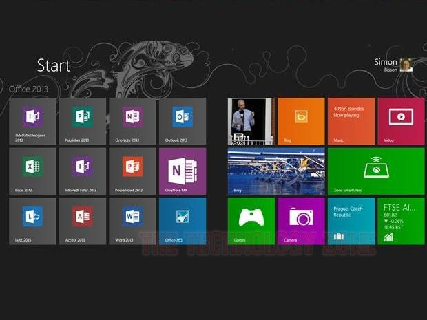
Microsoft's new interface for Windows 8 and Windows Phone 8, formerly known as Metro, is based on squares and rectangles of flat colour arranged on a seamless panoramic canvas; a complete break from the traditional desktop metaphor.
The new interface is a stylistic development of the look developed for Windows Phone 7, something that caused confusion when it was announced in 2010.
"When I first saw the Windows Phone UI ... I was genuinely surprised. The flatness of it, an awful lot of white space ... I mean, it was clearly a shift in direction from what we've been seeing on the other platforms," said Shane Morris, formerly a Microsoft user interface evangelist, but now a user experience designer with Automatic Studio.
"I literally thought that Microsoft was being very clever and not revealing the final user interface. Instead, it put in place these square, coloured placeholders where the user interface would be revealed," Morris told ZDNet.
But the interface was real, and the abandonment of the familiar desktop metaphor was also real. Microsoft believes that it's appropriate in the era of digital natives.
"We're at a point where our users are sufficiently confident with using information technology that they don't need the reassurance of those references to real-world objects. That would be Microsoft's argument," Morris said.
"That's why the new user interface has what a lot of this what we call chrome [borders, shading, textures, and the like on user interface elements] stripped out, the argument being we can just focus on the actual information now," he said.
"You manipulate the content itself. You drag it, you drop it, you poke it. As an old-school usability guy, I found that quite confronting. Traditionally, my job was to provide enough signals onscreen to communicate to users what you're supposed to do."
In his presentation at Microsoft TechEd 2012 this week, Morris showed how the Windows Phone 7 and Windows 8 interfaces have evolved from Microsoft's previous content-focused interfaces for Media Center and Zune.
"Those applications similarly don't have a lot of chrome, the focus on the content, there's a lot of animation, a lot of use of text," he said.
The inspiration for Microsoft's new visual style can be traced back to design schools from the middle of the 20th century, including the International Style or Swiss School, the Bauhaus movement, and motion graphics such as the cinematic title designs of Saul Bass, as well as the wayfinding signage used in airports and urban transit systems.

The desktop metaphor, with folders of files and overlapping windows, is now more than three decades old. Developed at the Xerox Palo Alto Research Centre (PARC), it made its first commercial apearance in the Xerox Star (pictured) in 1981, before its evolution through the Apple Lisa, Apple Macintosh, and Microsoft Windows to the many variations we see today.

Windows Phone 7 and Windows 8 were derived from earlier content-centric and text-enabled designs from Microsoft, including Windows Media Centre (pictured), Zune, and, long before them, the Encarta CD-ROM encyclopedia.

Wayfinding signage in airports and urban transit systems is based on the repetition of simple rectangular shapes and a simple colour palette. This inspired the original name for Microsoft's new interface, Metro.

"The Swiss School [also known as the International Style] arose early last century, and really it was mainly in print media, posters and advertising, book covers, stuff like that," Morris said.
"The premise behind this design movement was that if we just show the information in an authentic way, that is beautiful unto itself."
The Helvetica typeface, designed to be readable at many different sizes, came from this movement, as well as the use of text to visually communicate an information heirarchy.
The Helvetica typeface, designed to be readable at many different sizes, came from this movement, as well as the use of text to visually communicate an information heirarchy.

The Bauhaus school's catchphrase was "form follows function" or, as Morris explained it, "If a sufficient and elegant design is the minimal design necessary to deliver the purpose."
Decoration was considered unnecessary.

A key inspiration for Microsoft's new visual style were the film title sequences created by Saul Bass, in particular those for movies like North By Northwest.
"In the olden days, we designed a series of static screens or windows, and we string them together in our user interface. We now have the ability, both in terms of the platform capabilities and also with the design tools that we have available, to start thinking much more carefully about how things move about on the page," Morris said.
"The great power of animation, of motion design, is that it leverages the way we naturally process information in the real world."
"The great power of animation, of motion design, is that it leverages the way we naturally process information in the real world."

Parallel to Microsoft's evolution of this visual style has been a creative style known as kinetic typography, with words moving onscreen to convey a message. Sometimes, this breathes new life into a text. Sometimes, it's pointless animation.


